
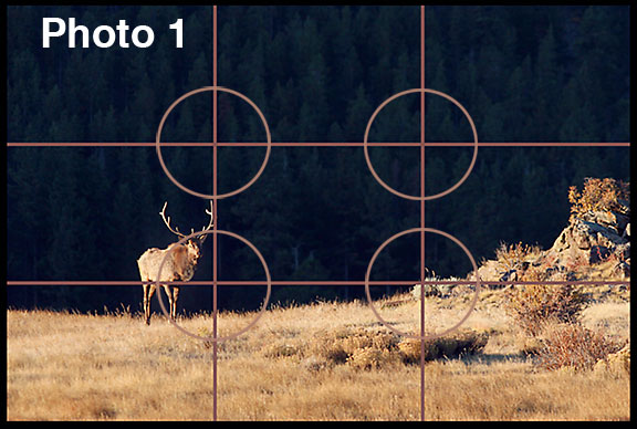
Bull elk walking across Moraine Park in Colorado’s Rocky Mountain National Park.
A great way to push your photography to a higher level is by understanding the rule of thirds. This simple, but useful compositional element can greatly increase the quality of your photography or art. For this reason, the rule of thirds will begin our landscape photography tips series.
Photo Tic-Tac-Toe
The best to way understanding this basic rule of design is to imagine a tic-tac-toe grid placed on top of a photo. Where the lines intersect are the “sweet spots” We should place the key elements of our photographs in the vicinity of the sweet spots. In order to keep balance in a photo the key element does not need to be placed directly on the sweet spot, but close to it (see circles in image 1). We should always keep our horizon lines on or above the top third of an image or on or below the bottom third (image 1) of an image. The classic vacation sunset shot with the sun smack in the middle of the photograph does not work.
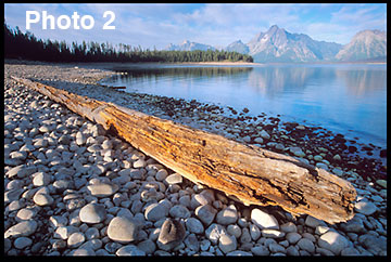
Mount Moran and Coulter Bay in The Grand Teton National Park, Wyoming.
An important question one may ask is, “If I don’t place the horizon line in the center how do I determine which third to put it on?” The two photographs of Mount Moran and Coulter Bay (images 2 and 3) answer this question. A photographer should place the horizon line at our above the upper third when the foreground is of greater visual interest in a photograph than the background (see image 2).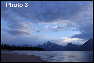

Proper use of the Rule
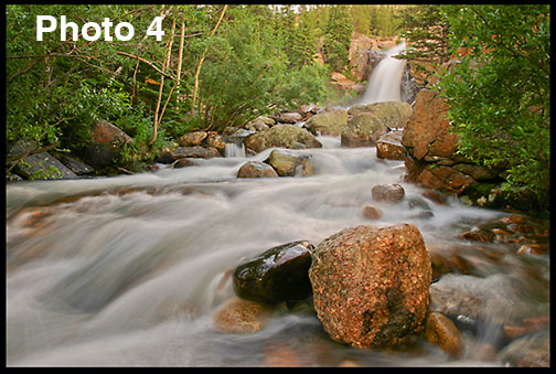
The flowing water of Alberta Falls in Rocky Mountain National Park
Rule of thirds is a great compositional tool, but a photo does not have to fit the rule to be a great photo. Don’t ruin a photo trying to make the photo fit. One common mistake is having the subject on one of the sweet spots in the photo and having the rest of the image filled with dead space. The only time you want empty space in a photo is when it adds to the story, as with the elk photo. The shaded black trees bring time (sunrise) and place (a mountain valley) to the photo adding to the story. The large negative space also adds to the story by giving a feeling of a vast wilderness. The rocks opposite the elk add balance.
So don’t compromise the rest of the composition in attempt to get something on a third. Filling the frame with the subject or possibly putting the most important part of the image—such as someone’s face or eye—on a sweet spot can avoid this.
Another mistake is having the subject too close to the edge of the frame and looking off the photo. In most cases, when placed on one of the third lines, our subjects should be looking toward the middle of the image and not towards the edge. In image 1 the elk is walking towards the center of the photo and in the waterfall shot (image 4) the water is flowing into the image from the falls.
Email Me Your Shots
Okay, now it’s your turn. Go and get some great rule of thirds shots. I’d love to see what you’ve shot. Email me you photos at pmcenter-photos@yahoo.com.
Click for part one and here for part three of this series.
Please note: Your retain full rights to your photos. I will not use them in anyway without written permission from you. By sending me an email you will be subscribing to my photography email list. You will receive an update when I make a new photo tips post. Thank you.